Tuesday 1 April 2014


Friday 28 March 2014

Thursday 27 March 2014
Colour Scheme
 |
| Monochromatic For this one i used variations of a green colour. I feel that the colours to highlight the different objects make it look really bright and 'in your face'. i have used a dark green for text to make it stand out from the waves which are a mint colour. The turquoise used on the whale is very bright and this draws your attention to the centre of the page. |
 |
| Analogus For analogus i have used the three most saturated colours next to each other in the colour wheel. This is pink, blue and purple. The pink used on this is extremely saturated and this makes the whole of the colour look very messy and childish. |
 |
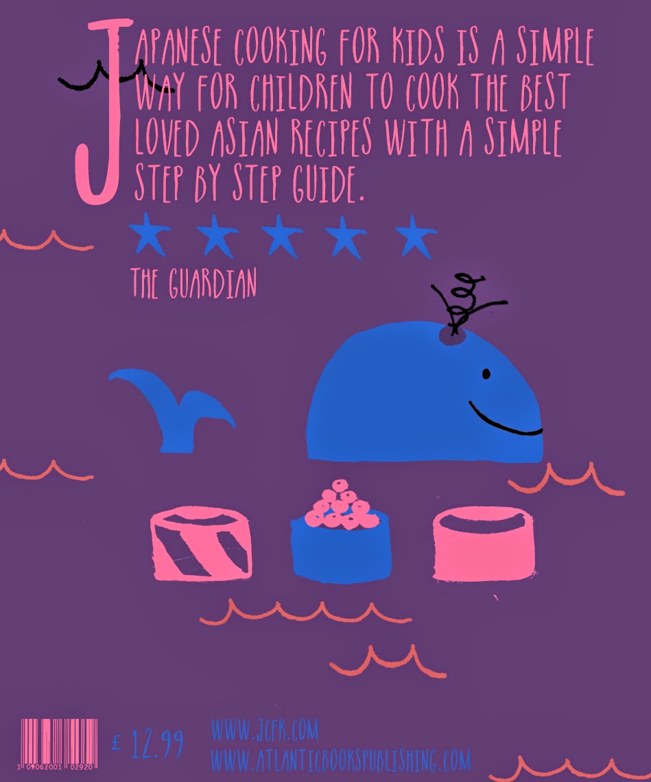
| Complementary The complementary colour scheme is my favourite so far and also has a very traditional asian feel, which is what I'm going for, the salmon pink stands out well from the blue background and the blue background also looks like the sea, which fits with the theme of my cookbook. |
 |
| I used the colour wheel decide which colours to use for analogous and complementary. |
 |
| For the monochromatic colour schemes i used only the colours in this square, including black,white and grey. |
Wednesday 19 March 2014


Friday 14 March 2014
Digital Type
 |
I have chosen some digital types that I feel could work on my final piece. The first page of type are display types that i want to use on the front cover - mainly the title. I prefer the display types 1, 2, 5, 7 and 8 as they are bold and have a very asian style, but is still easy to read. I think the third type is to subtle and wouldn't stand out as the main type on the cover. I think the lettering on the fourth type is too spaced out, especially on the 'K's and this makes it harder to read and is less effective. I think the 6th type is too small and is very hard to read but is very effective as an oriental type. I think the 9th type is too decorative for the style i am trying to create and would look better in a mixture of higher and lower case. On the second page i have chosen a type for sub titles and also small bursts of body text. I like the first type, fourth type, fifth type, sixth type and the 8th type as they are easy to read and look very hand made which is in the style and genre of my book cover. The 2nd and 3rd type are more display types and i don't think they would fit in with the style of book. I think the 7th type is too tall and would be harder to read with more than a few words. The 9th type is too hand drawn and is hard to read. |
Tuesday 11 March 2014
Hand Drawn Type


 |
| I have first brainstormed ideas, i then started to refine some of my ideas and chose the one which was most effective. i then drew every letter out and scanned them on to the computer. I then took them into photoshop and edited and coloured them. after this i did a trial of some letter with 'Cooking For Kids'. |
Subscribe to:
Posts (Atom)